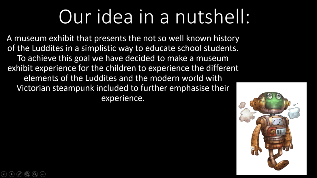
Intro:
Super Mario Odyssey is the next big game that released October 27th 2017. This was the first mainstream Mario game to the Nintendo Switch. With the game, you obviously play as Mario but you meet a new companion, Cappy!
For this comparison, I will be comparing the retro aspects that Mario Odyssey has to offer and the more realistic aspects. With all of that said and done, the first category will be the statistics.
Statistics:
How Many Power Moons Are Available In Odyssey?:
A total of 513 moons are available to the player before completing the game fully (and unlocking the Mushroom Kingdom, Dark Side of the Moon and Darker Side (Of the Moon).
When completing the game, a further 129 moons are available to you, this is by the 3 new kingdoms that were unlocked.
However, during the end-game, there is a singular moon rock on each kingdom (excluding dark and darker side of the moon) these add additional moons to each kingdom.
Which gives us another 194 additional power moons to be available to the player.
This gives us an end total of 836 power moons (This doesn’t include any power moons from the shops you find in each kingdom).
What Do The Paintings In Odyssey Do?:
This is supposed to be a reference to Super Mario 64 as in the game Mario is able to jump through paintings to gain access to the many different levels. There is a total of 10 paintings which instead of taking you to a completely different level, they take you to an inaccessible part of each kingdom that require the paintings to access.
Locations Of Each Painting And Where They Go:
- Cascade Kingdom: This painting will lead to Bowser’s Kingdom.

- Sand Kingdom: This painting will lead to Metro Kingdom.

- Lake Kingdom: This painting will lead to Sand Kingdom.

Wooded Kingdom:
(This painting will lead to Luncheon Kingdom).
Metro Kingdom:
(This painting will lead to Wooded Kingdom).:no_upscale()/cdn.vox-cdn.com/uploads/chorus_asset/file/9608707/Metro_Kingdom_painting_location_2.jpg)
Snow Kingdom:
(This painting will lead to Cascade Kingdom).
Seaside Kingdom:
(This painting will lead to Lake Kingdom).
Luncheon Kingdom:
(This painting will lead to Mushroom Kingdom).
Bowser’s Kingdom:
(This painting will lead to Seaside Kingdom).
Mushroom Kingdom:
(This painting leads to Snow Kingdom or Seaside Kingdom).
Important Note:
Bowser’s Kingdom and Mushroom Kingdom will either lead to Snow Kingdom or Seaside Kingdom depending on which is in Bowser’s Kingdom. The opposite will always be located in Mushroom Kingdom.

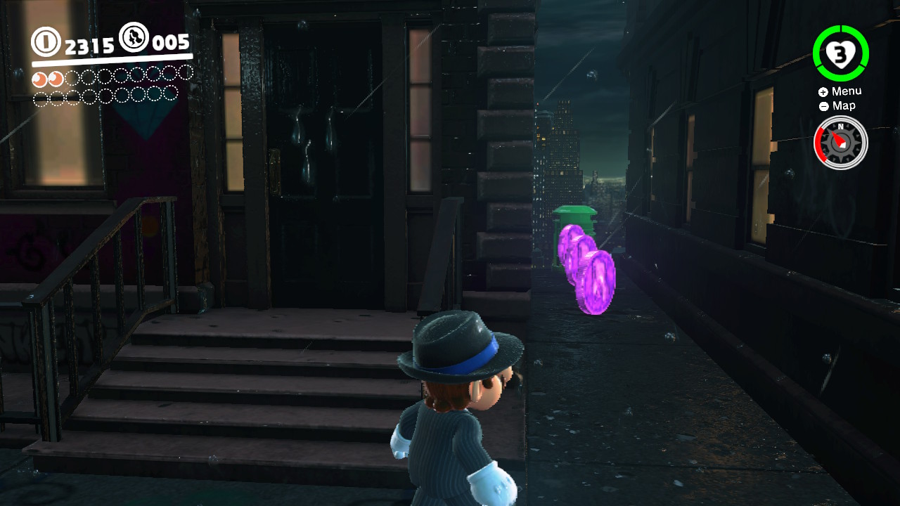
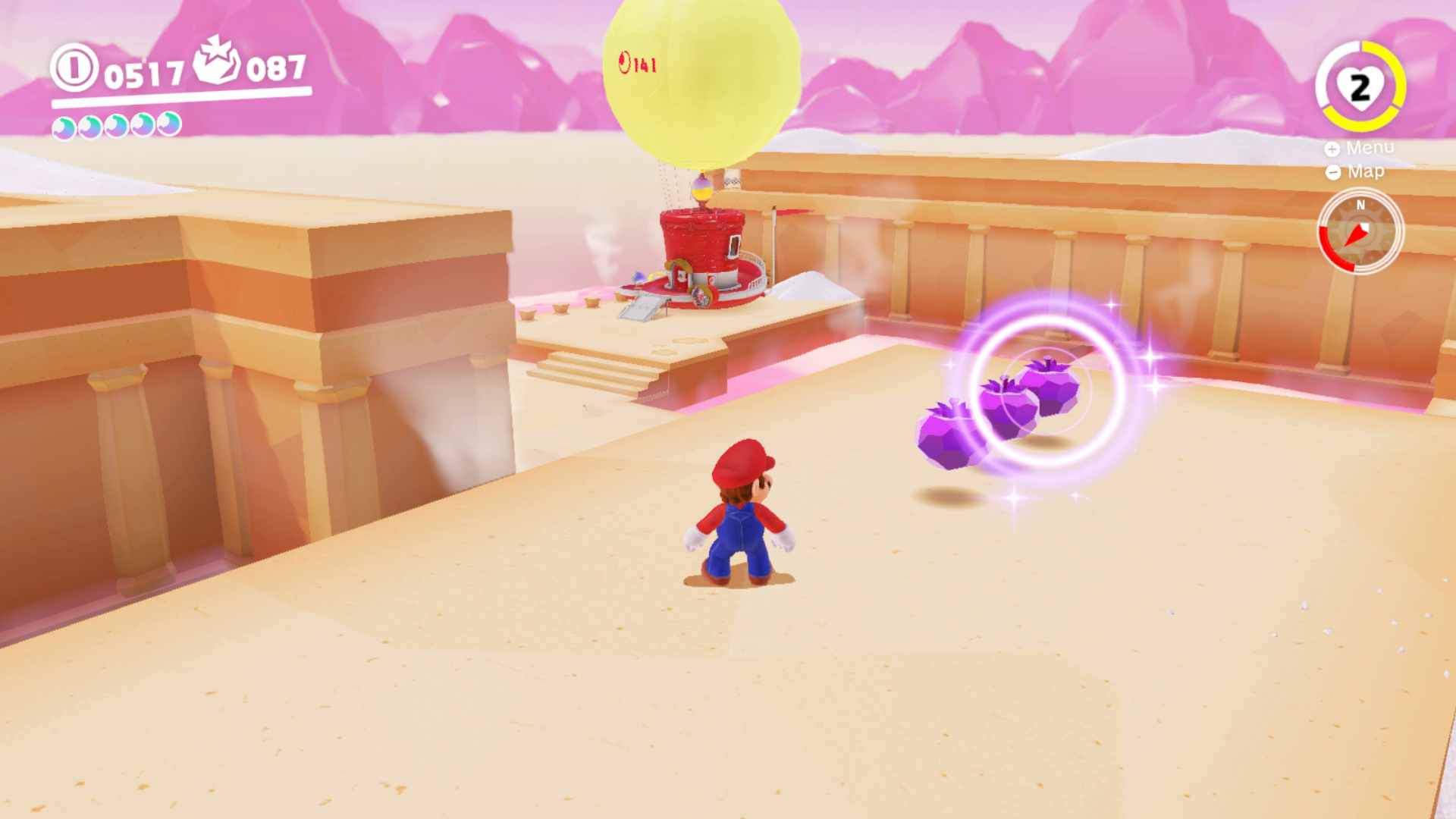
Why Are There Purple Coins In Odyssey?:
Purple coins act as currency for each kingdom, being exclusive to the kingdom that you collect them in. For example, If you collect 10 purple coins in the Hat Kingdom, They can only be used in the Hat Kingdom. However, these coins can be used to buy collectables and stickers for the Odyssey but also costumes for Mario to play dress up with!
Hat Kingdom:
With the Hat Kingdom, the design for these coins is a purple top hat, very fitting with Cappy’s design and also the overall design of the Hat Kingdom. There are 50 coins in total to find in the kingdom but they are quite easy to find if you enjoy exploring the kingdom. (Which is very fun and rewarding to do).


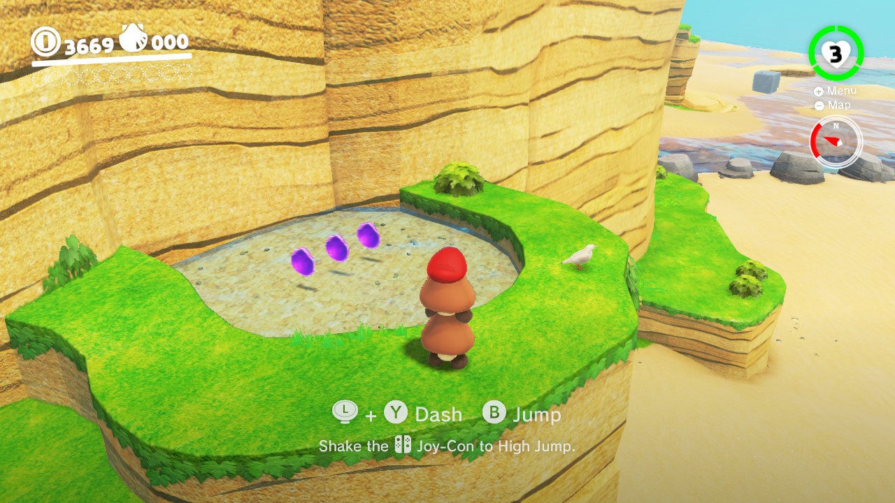
Cascade Kingdom:
In this old fashioned (literally) prehistoric kingdom, the design is a stone wheel. This design relates to the caveman feel and unlockable costume that the purple coins in the Cascade Kingdom can buy you! But it also could be about the sleeping T-Rex…But there are 50 coins in total to find and collect!
:no_upscale()/cdn.vox-cdn.com/uploads/chorus_asset/file/9550303/Cascade_Kingdom_purple_coins_1.jpg)
:no_upscale()/cdn.vox-cdn.com/uploads/chorus_asset/file/9550297/Cascade_Kingdom_purple_coins_4.jpg)
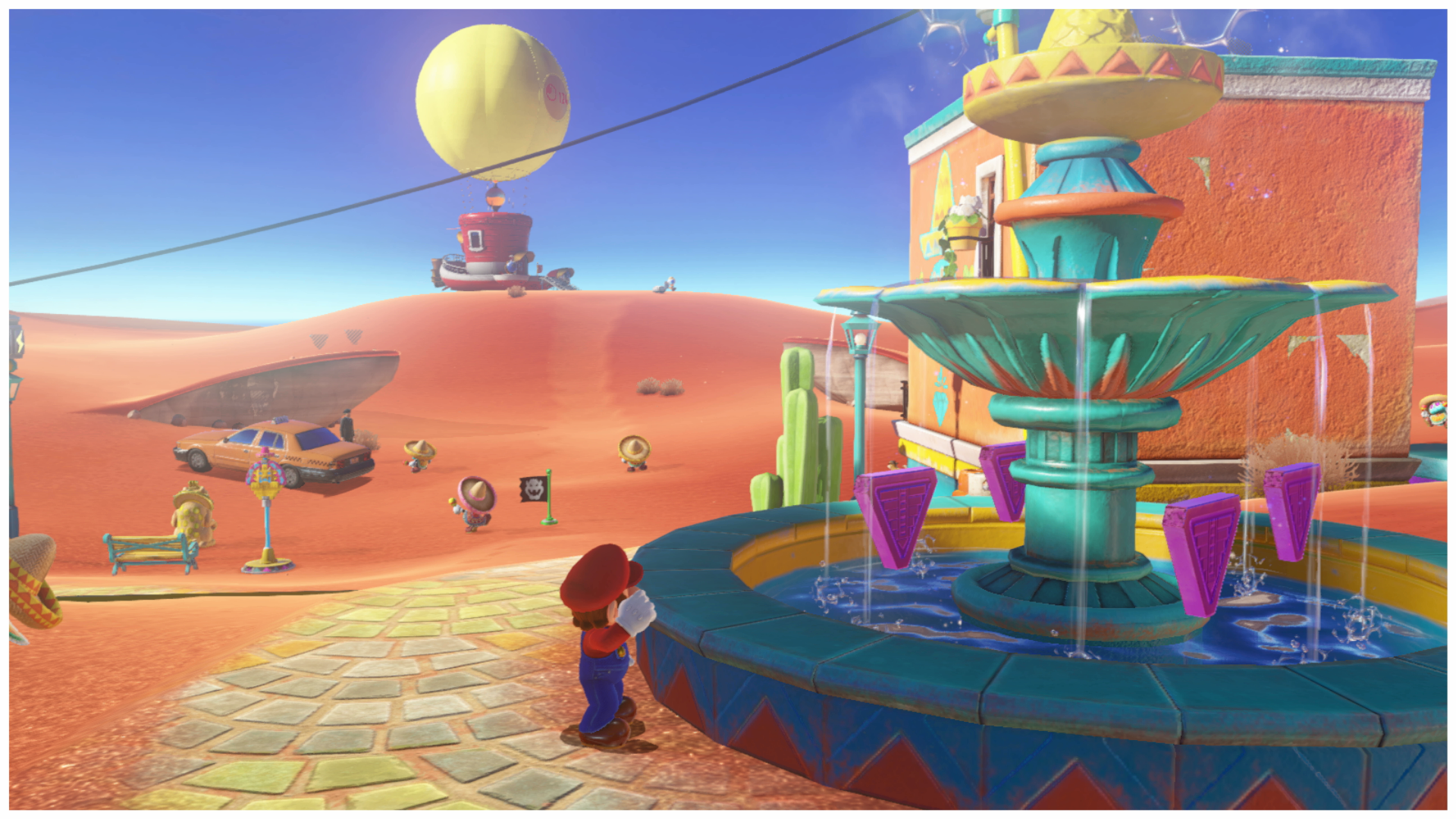
Sand Kingdom:
In this desert-like kingdom, You land the Odyssey to see it’s nothing but Ice! While trying to sort out the problem at hand, you will come across nearly half of the purple coins easily but make sure to explore this huge kingdom! It has many secrets to hide! This is because this kingdom has 100 purple coins to collect so get exploring!

Lake Kingdom:
In the Lake Kingdom, We are challenged with Bowser having stolen a dress for the dear Princess Peach to wear as her wedding dress. This kingdom has a lot to offer with there being a lot of timed jumps involved (And a lot of air bubbles!). For the purple coin total, it’s only 50 this time but they’re reasonably easy to come across.


Wooded Kingdom:
In the Wooded Kingdom, The story of a problem after problem continues. But this kingdom has a lot to explore…including if you were to jump down from near the Odyssey….there’s a whole other area down there! But there also is an angry T-Rex as well….explore at your own risk! This time we’re looking for 100 coins instead of 50.


Lost Kingdom:
In the Lost Kingdom, We meet an old foe. Klepto! After you are without Cappy because of the bird, you do have access to some of the purple coins but I personally recommend using Cappy. There are 50 coins in total to hunt for but it’s pretty easy.

Metro Kingdom:
In the busy city of the Metro Kingdom, we come across another familiar face! Pauline! She is the mayor of New Donk City! This city is huge and it’s fun to explore it but there are 100 purple coins to scout for. You better get searching!

Snow Kingdom:
In the chilly Snow Kingdom is where you will be heading next! With it’s freezing waters and snow everywhere searching may seem impossible but if you look hard enough and have a good sense of Mario logic you’ll be just fine. 50 coins is what this kingdom is holding.


Seaside Kingdom:
In the sunny seaside kingdom, we are shown that it’s similar to the lake kingdom, it’s mostly underwater but bigger, much bigger. This time instead of 50 purple coins it’s 100. It does take longer to find them all but it’s not too difficult.

Luncheon Kingdom:
Next up is the kingdom involved around food! With this kingdom, The player will carry on with the story, Defeat the boss (Cookatiel) and then be on your way to collect more power moons. Onto the topic of the purple coins, there are 100 to collect. With the purple coins in the luncheon kingdom, some are easy to find whereas some take a little more effort to get all of them.

Bowser’s Kingdom:
Now we end up in Bowser’s kingdom to attempt to save our beloved princess from being married to King Bowser! With the kingdom itself, it’s huge and full of enemies and challenges to try and stop you. There are 100 purple coins to find in this kingdom and they are hidden well, in some places which are quite the challenge and require skill to get all of them.
Moon Kingdom: 50 Coins
The moon kingdom is at it said in the title, On the moon!
Mushroom Kingdom: 100 Coins
Note: The Ruined Kingdom and the Cloud Kingdom don’t have any regional coins inside of them, this could be because of how small both of them are or the fact that they’re both used as arenas for 2 separate boss battles, the lord of thunder (A giant dragon) for the Ruined Kingdom and a good old fashioned fight with King Bowser in the Cloud Kingdom.
Characters:
With characters in Odyssey, there are two categories, Characters that are given dialogue and NPCs. (Non-Playable Characters) who do not have any dialogue that is unique.
Characters: (With Unique Dialogue):
- Mario

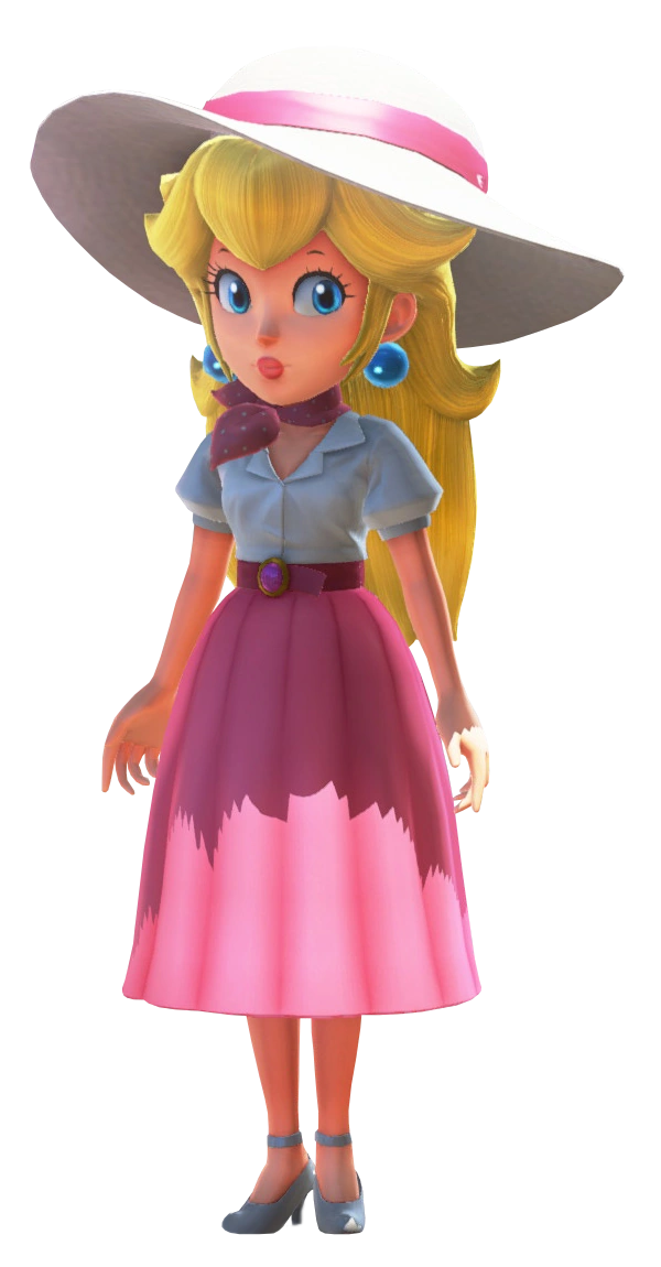
- Princess Peach (A cool thing that Nintendo has added in Odyssey is that after beating the main game, You can find Peach in every kingdom, besides dark side in a different outfit for each kingdom.) (This doesn’t include her normal pink dress and the wedding dress).


King Bowser
Cappy
Tiara
Captain Toad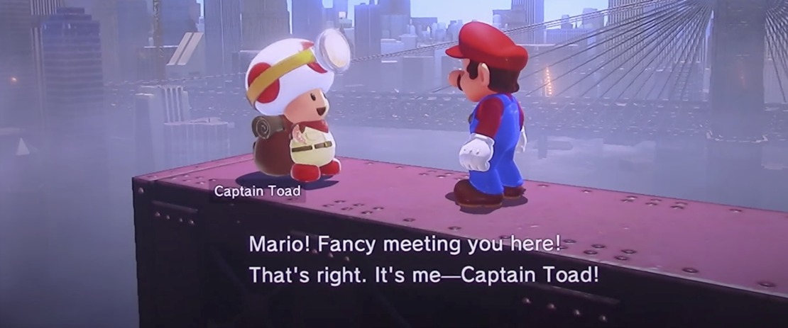
Hint Toad
Toadette
- Uncle Amiibo

Pauline
Characters (Without Unique Dialogue):
Levels:
Retro:
‘Retro’ Levels for Odyssey are known as ‘8-Bit’ Levels. These include 8-bit Mario having his classic sprite and sprite animation as you play these mini-levels like a normal 2D Mario platformer.
 (This doesn’t include any of the newer costumes that have been added since Odyssey’s release).

Realism:
For the more realistic side of Mario Odyssey, We’re presented with stunning graphics and textures on polygon models.
/https%3A%2F%2Fblueprint-api-production.s3.amazonaws.com%2Fuploads%2Fcard%2Fimage%2F797985%2F020f76e0-02a3-4bce-a074-f80f7a075df1.jpg)


Assets:
Retro:
With the retro assets that we see in Mario Odyssey, we see many different kinds. This is because having a retro aspect in such a modern game is a huge part of Odyssey’s charm and why so many Mario fans love it. It brings back memories from the past games that people experienced, Even when Mario started out as being known as ‘Jumpman’ in the arcade classic ‘Donkey Kong’.
Why Are All The Assets Made For Retro And Realism?:
The reasoning behind this is my own personal theory and opinion. Since I have easily put over 100 hours into playing Mario Odyssey, I’ve seen many assets in realistic graphics and retro graphics. The reasoning why they did this is because I personally think that this yet again adds to the charm Odyssey has and makes the game stand out to the other Mario games in the main series.
Realism:
Gameplay:
Retro:
Realism: