6.05.19-14.05.19:
This block of time was used to make sure that the illustrations used for our game were given their final coloured details, given line art and made sure that they looked like the original plans I had thought of.
Before:

Finn’s failed attempt
The reason why I personally have an extreme amount of dislike towards this attempt is because not only of the colours but also the eyes in particular. The eyes look too extreme for this simple illustration. As a result, the drawing looks really creepy (which wasn’t intentional at all).
Willow’s failed attempt
The reasons why I dislike this attempt at Willow is not only because of the same reasons that I had for Finn, but also it just didn’t look like the style I wanted to portray for Willow. Her personality is clumsy and cheerful yet here she looks completely lost in her own thoughts and slightly dumb…which was not what I wanted at all. It is true that I wanted her to be more caring and not as intelligent as Fifi but I didn’t want her to look completely unintelligent.
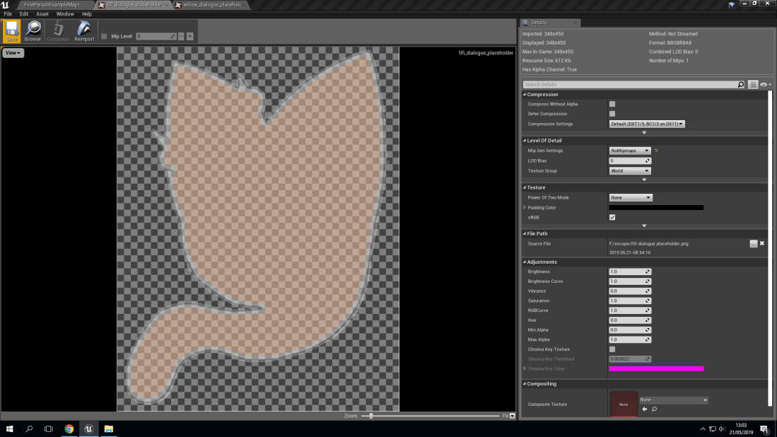
The reasons why I dislike this attempt at Fifi is not only because of the reasons that I have explained with both Finn and Willow but with Fifi not only did she not have the personality in her colouring and that the colours chosen were just bad, it was also the fact that I felt like I had rushed the illustration and that I felt like I hadn’t put any real time and effort into it.
After:
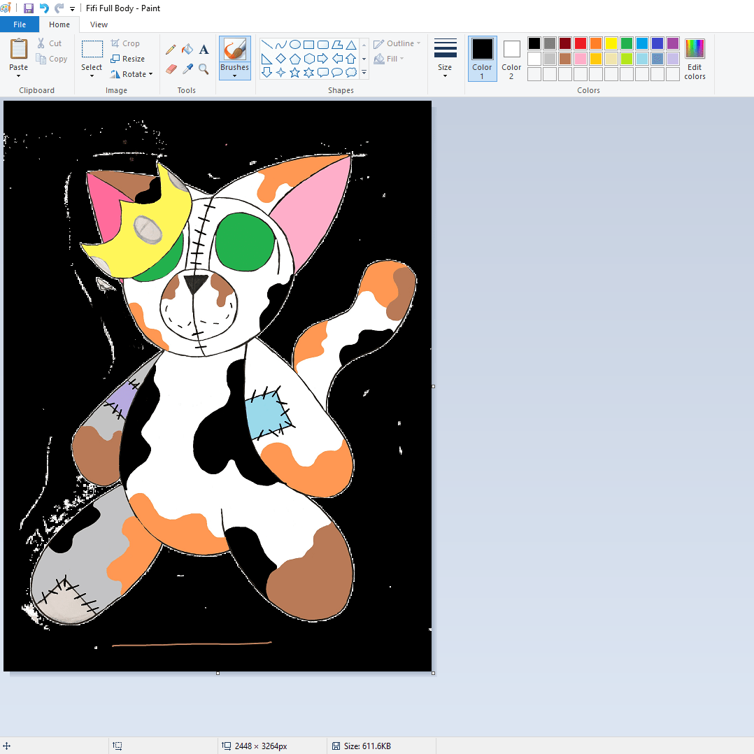
Fifi’s full body’s base colours nearing completion
Greyscale Fifi’s colouring nearing completion
Greyscale Willow’s colouring nearing completion
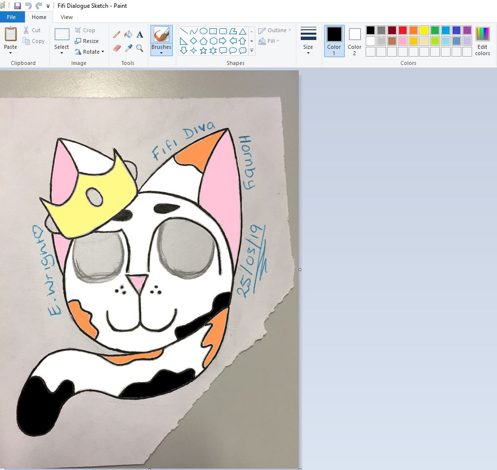
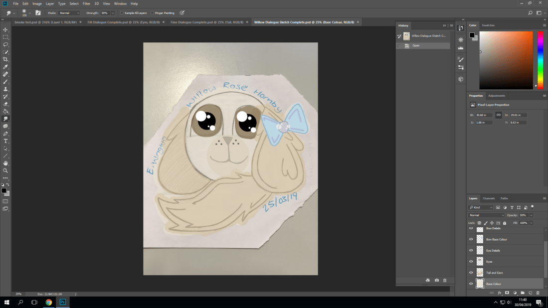
Fifi’s coloured icon’s colouring nearing completion
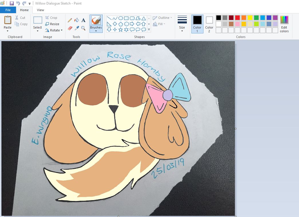
Willow’s coloured icon’s colouring nearing completion
The reason why there are such drastic changes in the before and after screenshots is because of myself and Joseph having discussed that because of my art style being more unique and non traditional (more cartoon like than realistic) we should make the icons have a cute but detailed look. In my honest opinion, I like the after results better than the before because not only of the colour choices but it genuinely works better for my style of illustration and drawing. Another reason is that it gives each character their own charm and personality, making them all stand out individually rather than together as a trio of characters. The final reason is that I actually felt like I was giving my best work.
15.09.19-21.05.19:
These final four days were used to make any final touches to the project. This included adding in the final versions of the artwork, making sure that everything worked and also finalising what needed to be done on the 21st. The reason for this was because I had an operation that day meaning I couldn’t attend college for the final day of production because of my operation. But I do have some screenshots for what was done in those final four days.
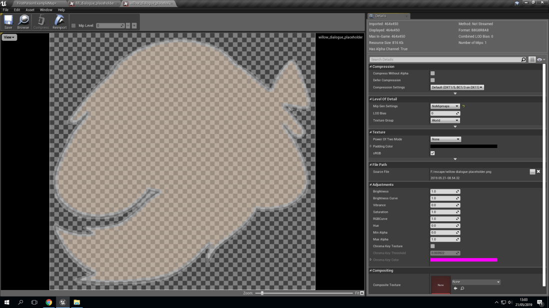
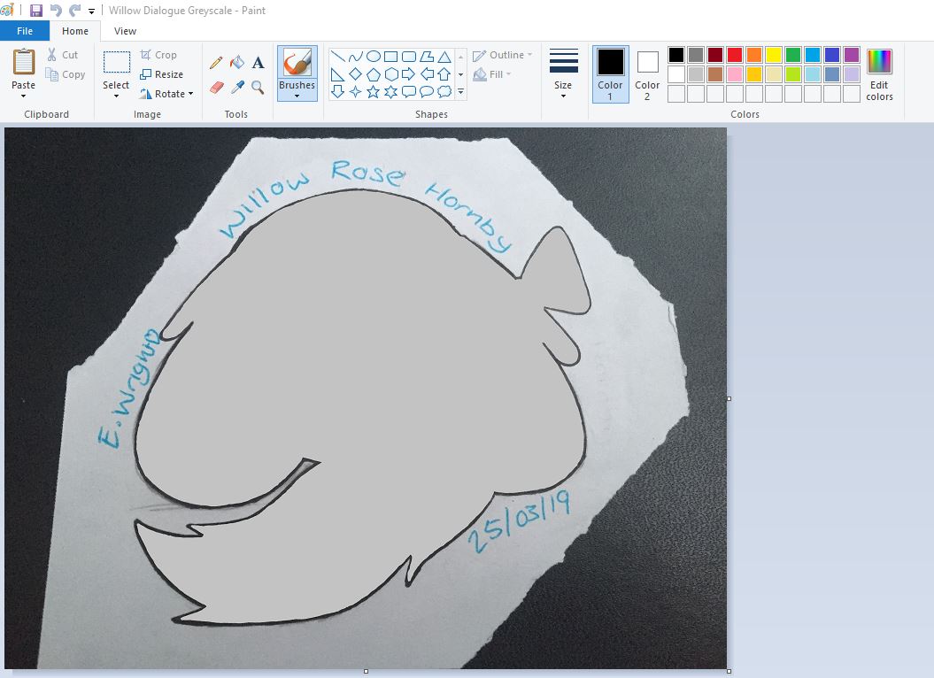
Willow’s grey-scale icon having the finishing touches made
With Willow being translucent, we made this choice because we didn’t want the player to see Fifi and Willow until the ending scene of the game, meaning that there is an added element of mystery and uncertainty. This also makes the story of ‘Family Secrets’ have a lot more depth and mystery because of the other character’s true looks not being certain or described by anything else but a simple silhouette. Another reason why we decided to keep Fifi and Willow just silhouettes was because of character development. Character development can be crucial in some games that are heavily story based. An example of this is an indie game known as “Five Nights At Freddy’s”. The reason why I chose this game in particular was because of the creator/main developer. He is known as ‘Scott Cawthon’ and he is known for the series of 7 games (The 8th one is still under development) that were very story based. However, what made Scott’s characters stand out was how there was a lot of unanswered questions that the player wasn’t given answers to. This meant that Scott could add a lot more depth to his story with all of the question’s answers being in the actual game’s story (lore).
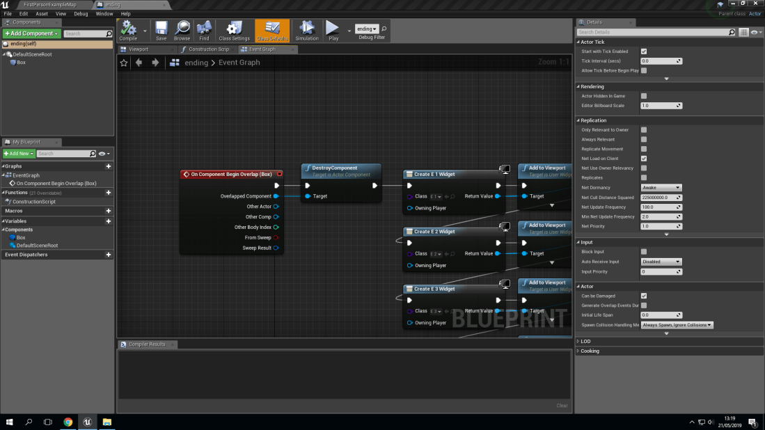
Blueprint of how the dialogue works
As you can see here, this is a simple blueprint. This actual blueprint will not only make the dialogue play for the characters but it also makes sure the dialogue won’t play again as the collision box that triggers the start of the dialogue will be programmed to delete itself from the game’s world after the sequence of dialogue is completed.
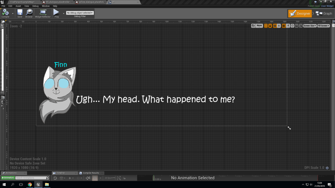
Example of how dialogue will look in the finished game
This is a screenshot of the final product of how our protagonist, Finn will show as not only a dialogue icon (Sprite) but also how his text will look to indicate that he is speaking. However, this screenshot also shows how the overall widget (another term for a blueprint that will appear on the screen as a heads up display) will look like on the screen when the game is started. This makes placement and sizing a lot easier as you can automatically have a preview of how the heads up display will look and then if there are any changes that need to be made they can be made.
![]()
Title screen’s final touches being made
The actual title screen of the game was made on the last day of production because we knew that other elements of the game were more important and that they would need to be our priorities instead of worrying about a title screen. This doesn’t mean that no effort was put into making the title screen, it only means that less time was needed to make it the way that we needed, which is a positive thing as we could keep on doing test runs to make sure everything worked and that nothing was ‘clipping’ or glitching. (Clipping means when two assets in your game are overlaying one another, making them flicker between each of them being in front of one another).
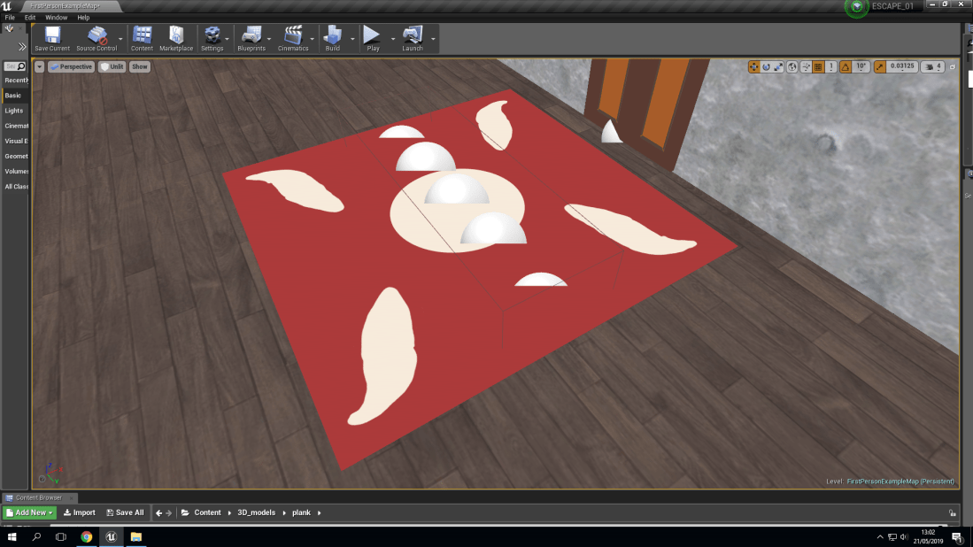
Rug being placed above the floor boards
The reason why there is a ‘rug’ on top of the floorboards is to add an element of surprise to the player. This is because if you were to have looked at the screen, the floorboards could be easily seen and the player could just try to avoid them. This means that the player knows what is going to happen next and as a consequence of this the game is not as exciting and classed as a ‘thriller’. With the rug being over the floorboards, you can’t see them. This makes the rug look like a decoration choice rather than being purposely placed to hide something.
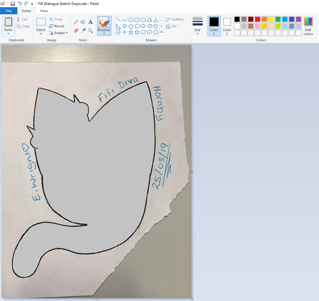
Fifi’s grey-scale icon having the finishing touches made
With Fifi being translucent, we made this choice because we didn’t want the player to see Fifi and Willow until the ending scene of the game, meaning that there is an added element of mystery and uncertainty. This also makes the story of ‘Family Secrets’ have a lot more depth and mystery because of the other character’s true looks not being certain or described by anything else but a simple silhouette. Another reason that this choice was made is because originally we were going to have Fifi and Willow be fully coloured with different emotions and even have them be slightly animated. This didn’t happen because of not only technical difficulties with my laptop but also my inexperience with animating and coming up with different concepts for both Fifi and Willow’s emotions. This also meant that Finn (protagonist) would have also needed that treatment. That would have meant 18 different fully coloured illustrations which then would need at least 2-3 more each for animation. This adds up to between 36-54 illustrations which would have been fully coloured and detailed. That doesn’t even include the full body designs. I total at maximum, that would have been 56 fully detailed and coloured illustrations.
